Back to work
(16)
Able®
Project
Client: Able®
Project: Brand Identity
Year: 2018
Credits
- T for Troels
Denmark’s market leader in business lunch catering needed a new image. With a strong partner network and delivery infrastructure in place, we helped craft a new and much greener brand vision, pushing not only themselves but also the industry to reframe the conversation around a good lunch.
Frokost.dk had been building a strong position in the local market as a middle man between quality kitchens and offices across the country. But as they were gearing up to take the next step, they realised it was time to look at the positioning of the platform they built. Were they truly part of the future of food or simply delivering for the status-quo?
Enter able®, a profoundly purpose-driven brand powered by a utility platform, delivering not only food, but also a strong point of view. The new brand platform meant stricter expectations towards the kitchens they could partner with, more focus on sustainability and pushing people’s overall perspective of what it means to eat well. The communication strikes a balance between, on micro-level, zooming in on the kitchens, chefs and ingredients served, and on macro-level, talking about the bigger role food consumption plays for the future of our planet.
able® is a platform supporting the future of sustainable food consumption.


Inspired by the elements of nature: air, earth, fire and water the color palette drives inspiration from the topic itself.


The simplicity and promise of the name able combined with the raw, contextual imagery give a sense of calm while reminding the audience of the bigger purpose of the brand.


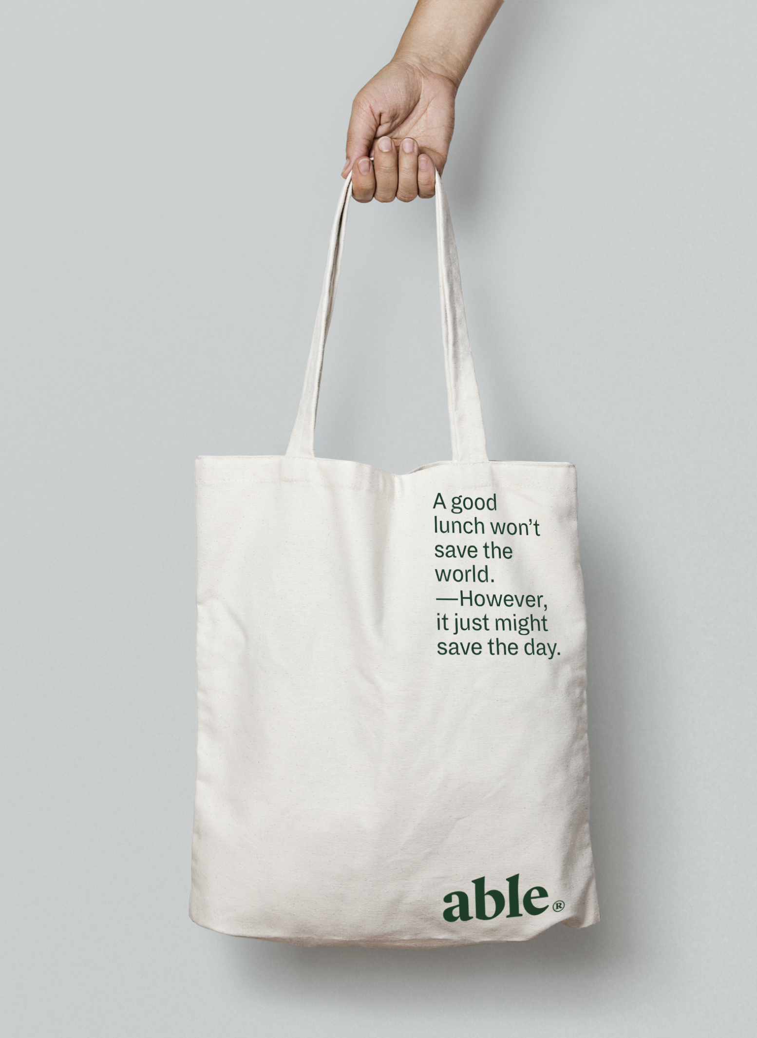

Packaging strikes a balance between describing the meal itself and branded messaging to reflect on the bigger picture of eating well.